Responsive Website
Filspari Healthcare Website Redesign
Led the visual redesign of a healthcare professional website, extending a campaign identity across the site while improving hierarchy, usability, and accessibility within a regulated environment.


The existing healthcare professional website needed a visual refresh to better reflect the brand’s campaign identity while maintaining its established UX patterns. The challenge was to elevate the visual experience, improve scannability of clinical content, and ensure accessibility—despite having only a single primary campaign image to work from.
Single primary campaign image asset
My Role & Ownership
I partnered with a UX Architect and Art Supervisor during early planning, then led UI design, visual exploration, system expansion, and development-ready handoff. I owned the visual direction, component refinement, accessibility considerations, and final UI execution across the site.
Visual cohesion significantly impacts perceived clarity and credibility in healthcare products
Clinical content must remain easy to scan, even as visual richness increases
A lightweight design system can balance flexibility with consistency on legacy platforms
Design Strategy
Design principles guiding the redesign:
Extend campaign visuals without overwhelming content
Preserve existing UX patterns while elevating hierarchy and layout
Design with accessibility and ADA compliance as a baseline
Build a scalable visual system that supports future updates
UI & Visual Design
Visual challenge:
How do you extend a campaign with only one image asset?

To solve this, we:
Zoomed into textures and details within the image
Abstracted shapes and color moments into layout elements
Used restraint to keep visuals supportive, not dominant

Design exploration
Multiple visual directions were explored to test how campaign elements could integrate into the existing site structure. These explorations helped balance brand expression with usability and regulatory clarity.


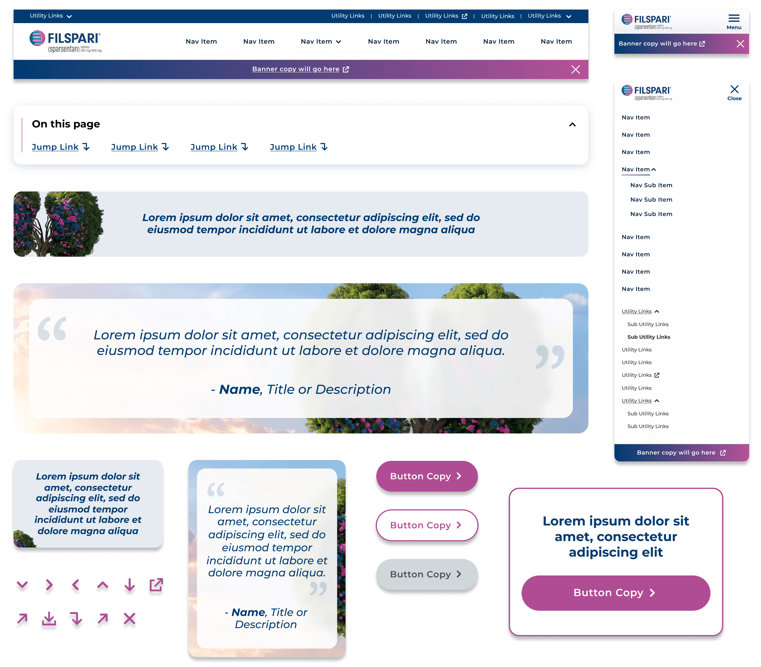
Design System Thinking
To support consistency and future growth, I expanded a small set of existing components into a lightweight, brand-specific design system. This system established clear typography, color, and UI pattern guidelines while ensuring seamless integration with the existing site architecture.
Sample of Design System components
Solution
The redesigned site delivers a more cohesive, visually engaging experience while maintaining strong usability and accessibility. By creatively extending a limited set of brand assets and grounding decisions in system thinking, the final product balances visual impact with clarity across devices.
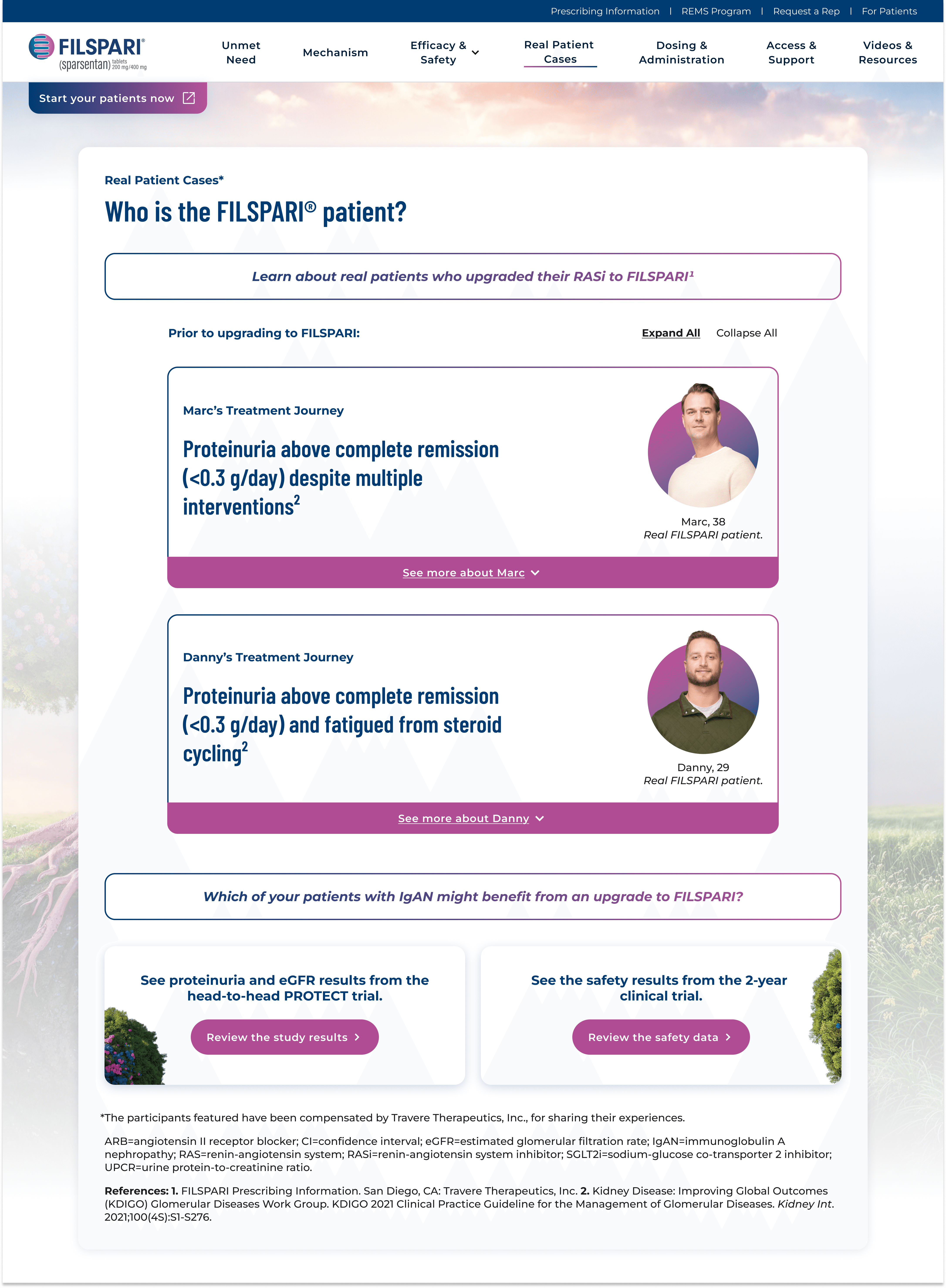
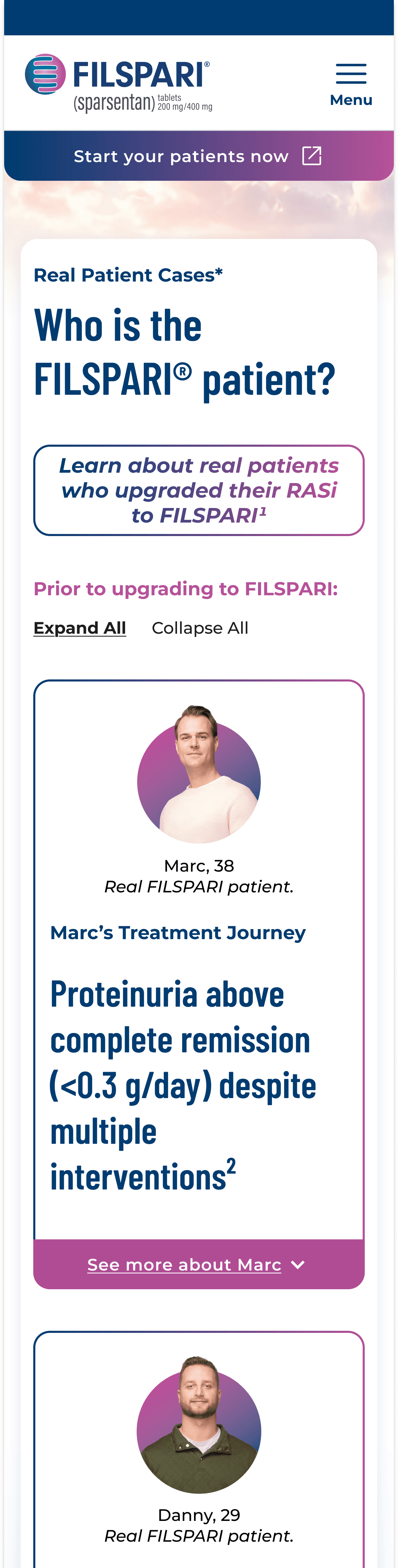
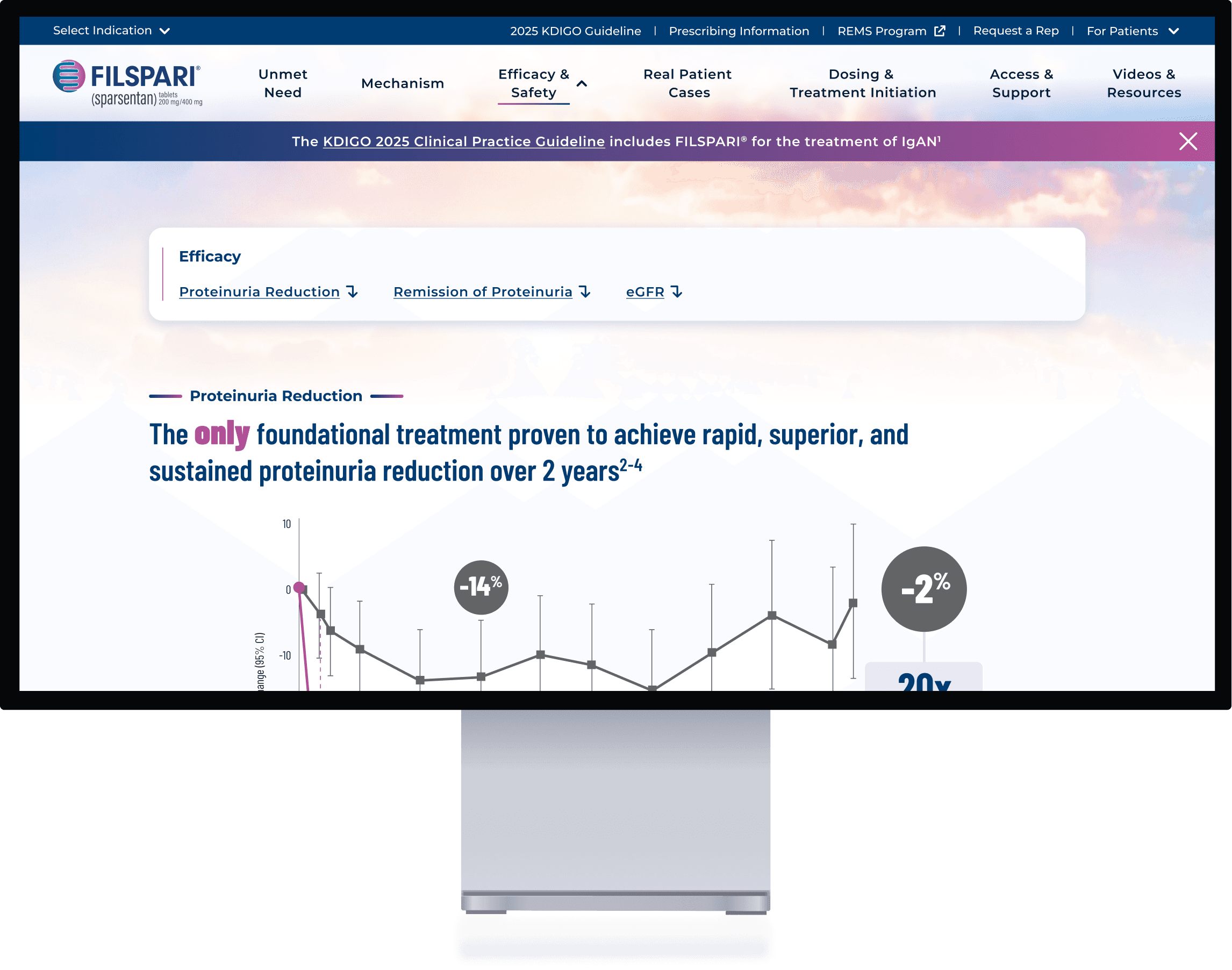
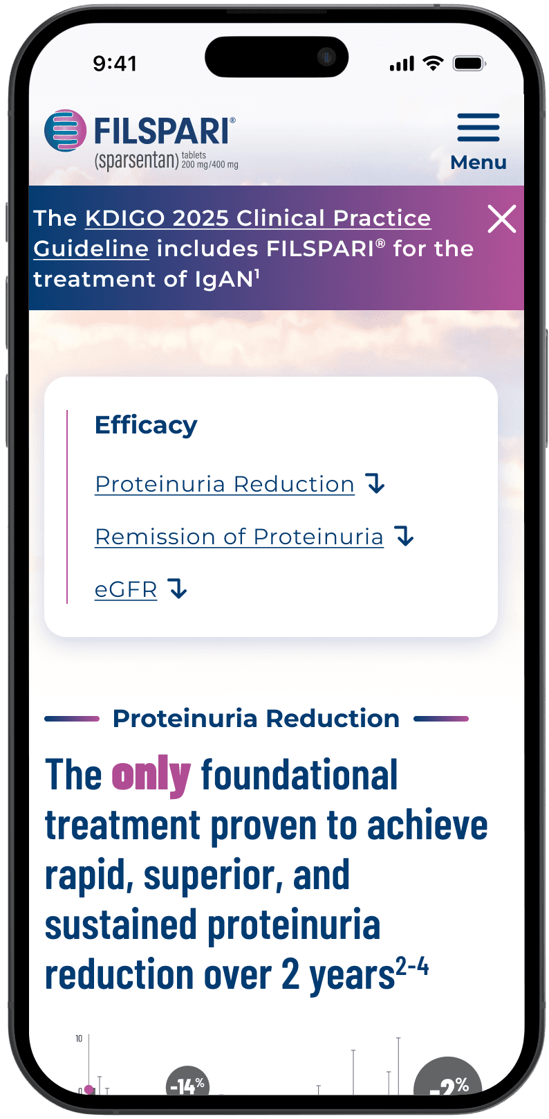
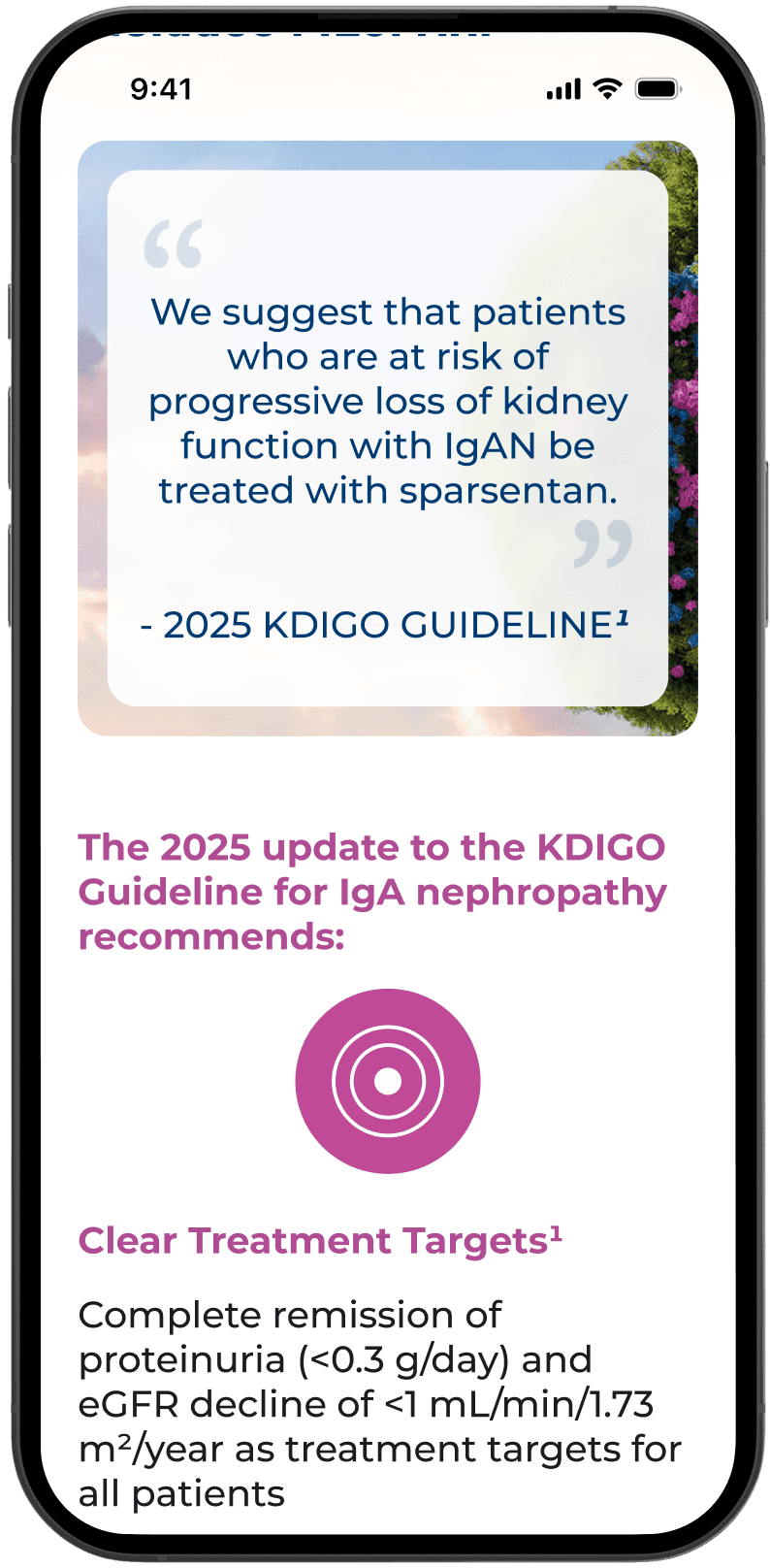
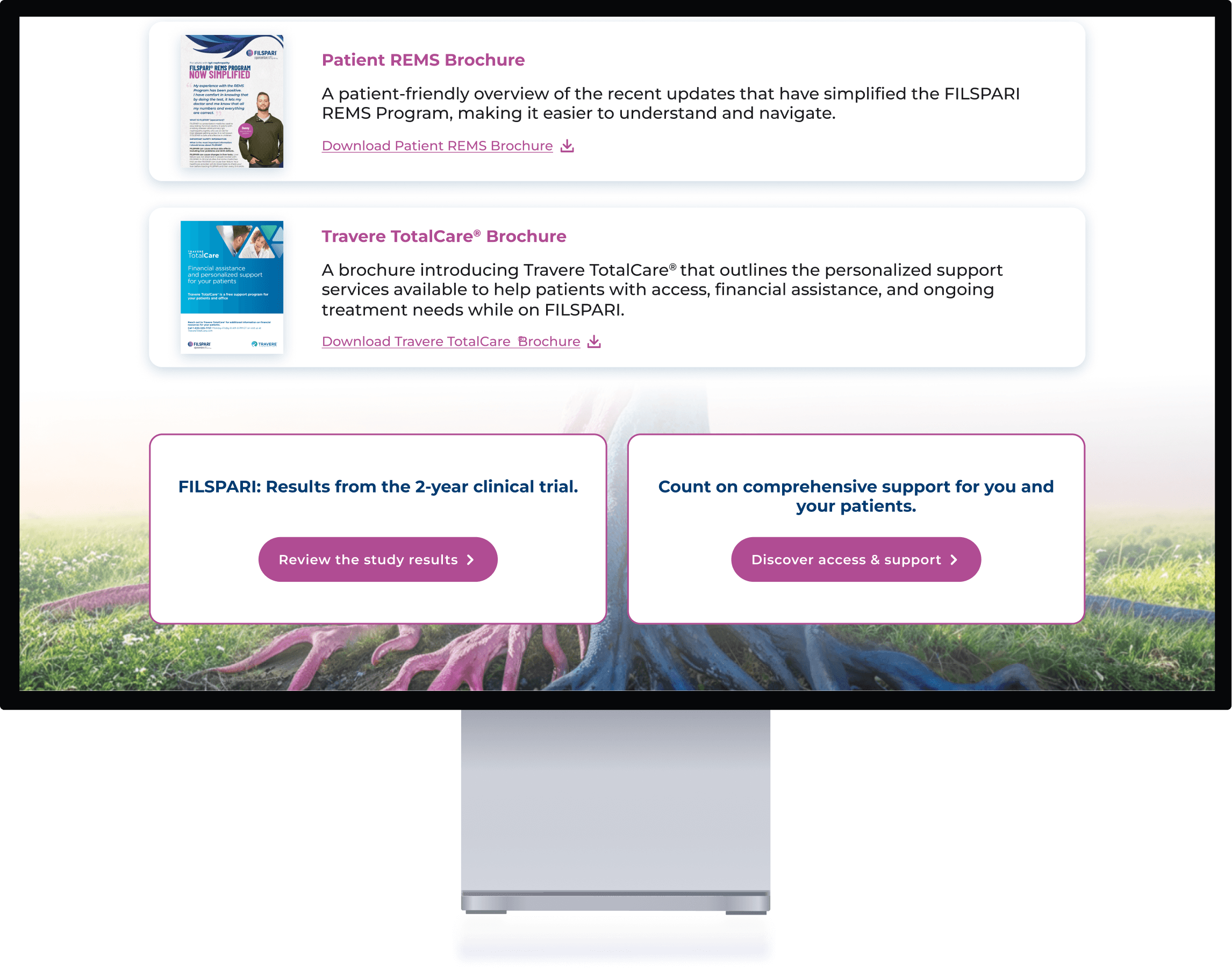
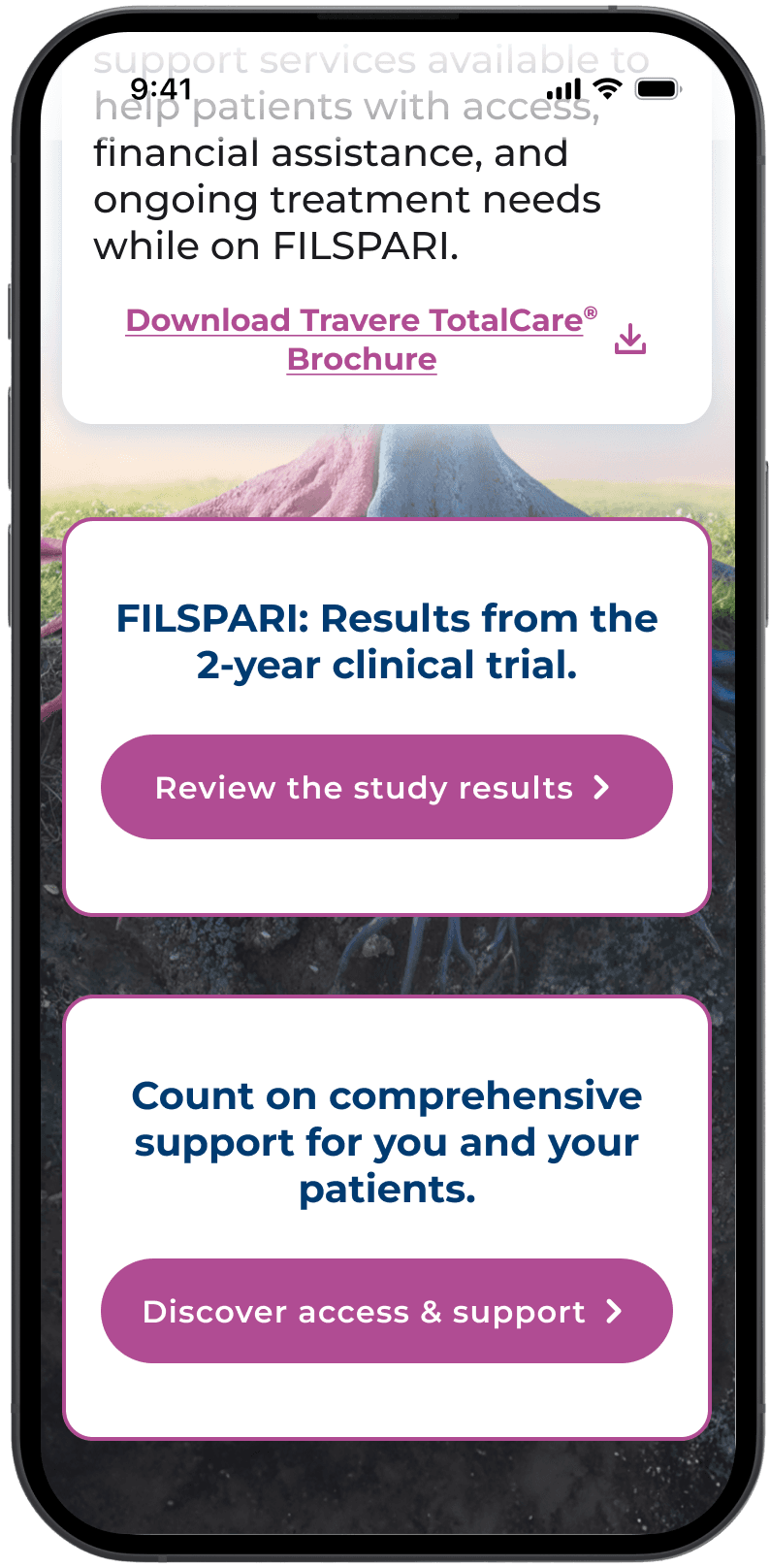
Tasteful campaign elements sprinkled throughout
We extended key campaign visuals across the site in subtle, thoughtful ways that enhance the brand without overwhelming the user experience.
ADA compliance in mind
Every design decision was made with accessibility in mind, ensuring the site is inclusive and meets ADA standards.
Keep good UX
We maintained the strong user experience established in the original site while enhancing visuals and accessibility.

Outcome
The redesign was well received by both the client and internal stakeholders, who praised the refreshed visuals and thoughtful execution. Despite limited brand assets, the team successfully extended the campaign across the site while preserving usability and accessibility in a regulated environment.
Next Up


Mobile and Tablet Microsite
Interactive Conference Experience
