Tablet Application
Patient Profile Builder for Healthcare Sales Teams
Company
Kyowa Kirin/POTELIGEO
ROLE
Product Designer (UI, interaction, prototyping, systems)
Team Members
UX Architect, Art Supervisor, Copywriter
Designed a tablet-based tool that enables sales representatives to build and present patient profiles alongside healthcare professionals, supporting confident, data-driven conversations in real time.
The Problem
Sales representatives needed a fast, reliable way to build and present patient profiles during live conversations with healthcare professionals without losing their place or breaking conversational flow. The experience also needed to be easy for healthcare professionals to follow along in real time.
My Role & Ownership
I partnered with a UX Architect during early planning, then led UI design, interaction design, prototyping, and system execution across the product. I owned visual direction, component patterns, and development-ready design handoff.
Key Insights From Sales Rep Interviews
Sales reps often prepare profiles in advance, but frequently adjust or build them live with healthcare professionals
Losing place mid-presentation breaks trust and disrupts conversation flow
Large tap targets and minimal scrolling are essential during shared use
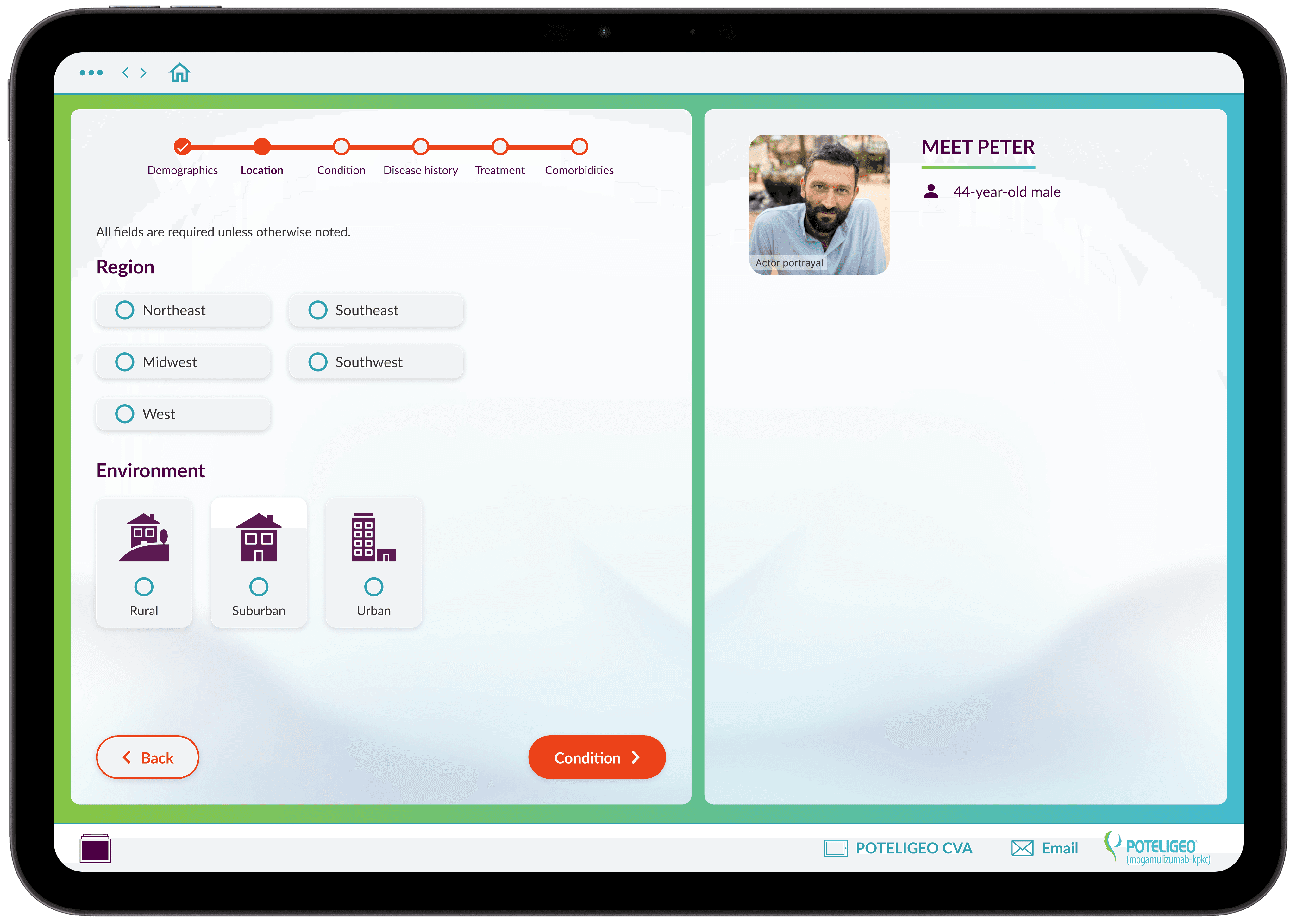
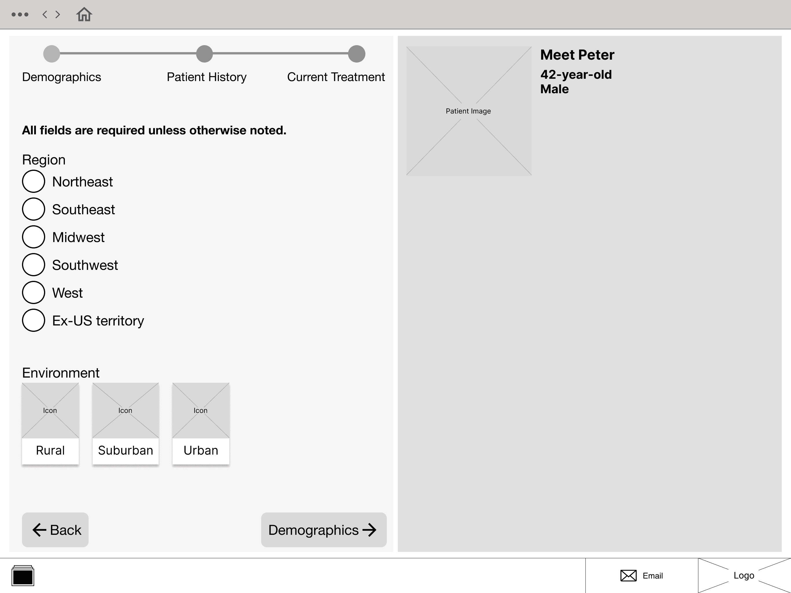
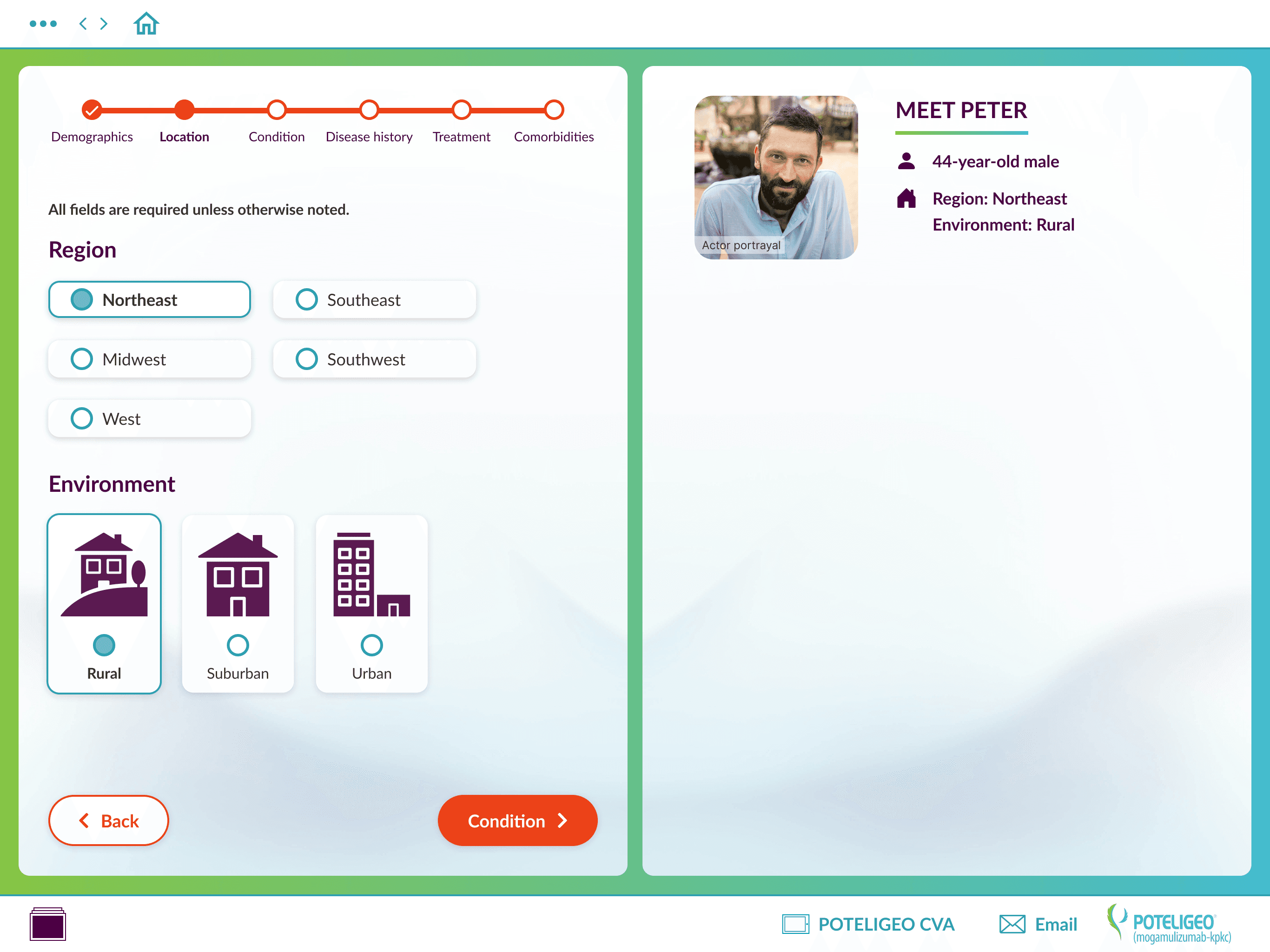
UX Structure & Flow (Collaborative)
Early flow and information hierarchy were developed in partnership with a UX Architect. My focus was translating this structure into clear interaction patterns and scalable UI components capable of supporting complex, variable patient data.
Design Strategy
The following principles guided design decisions throughout the product:
UI & Interaction Design
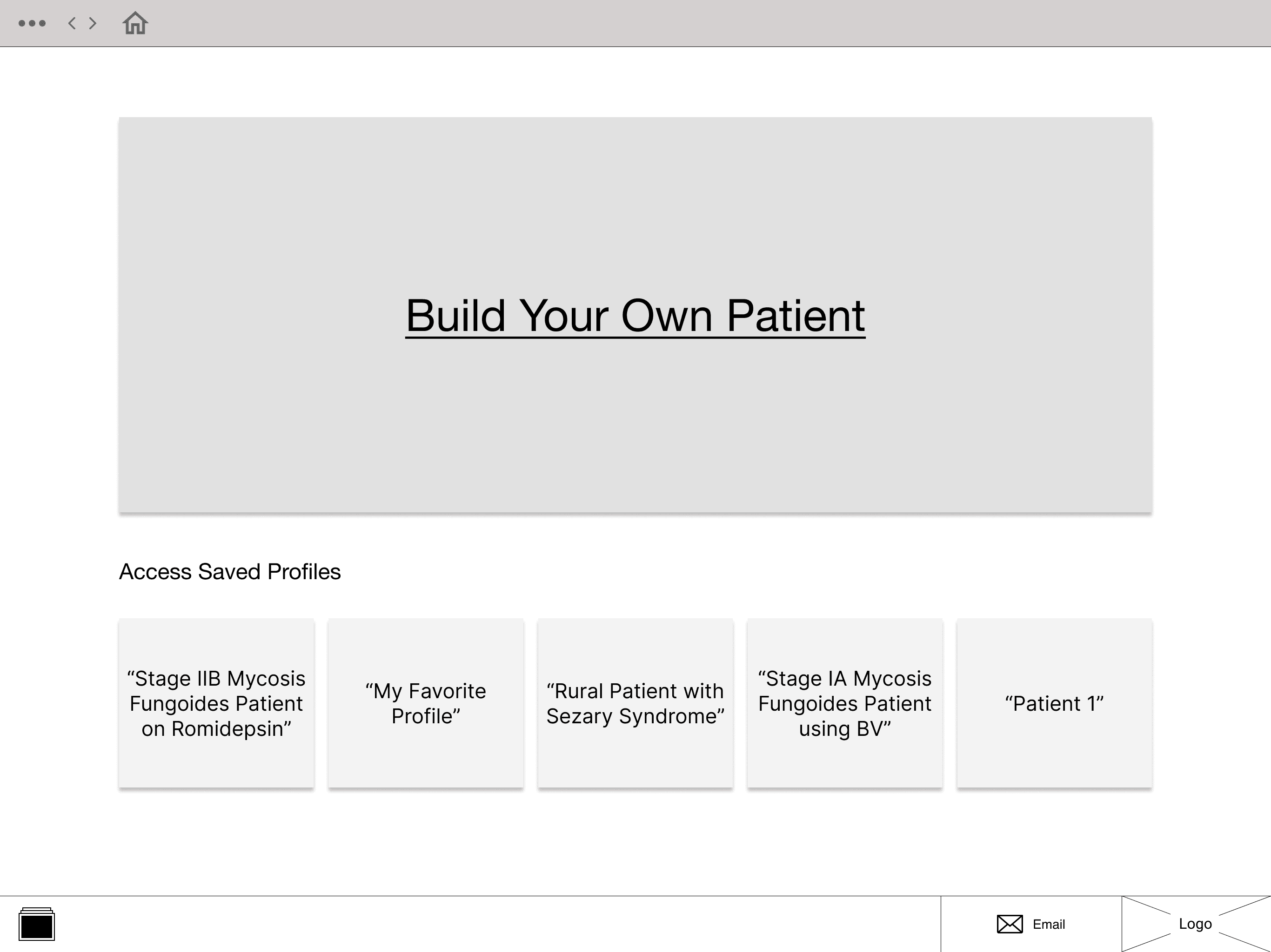
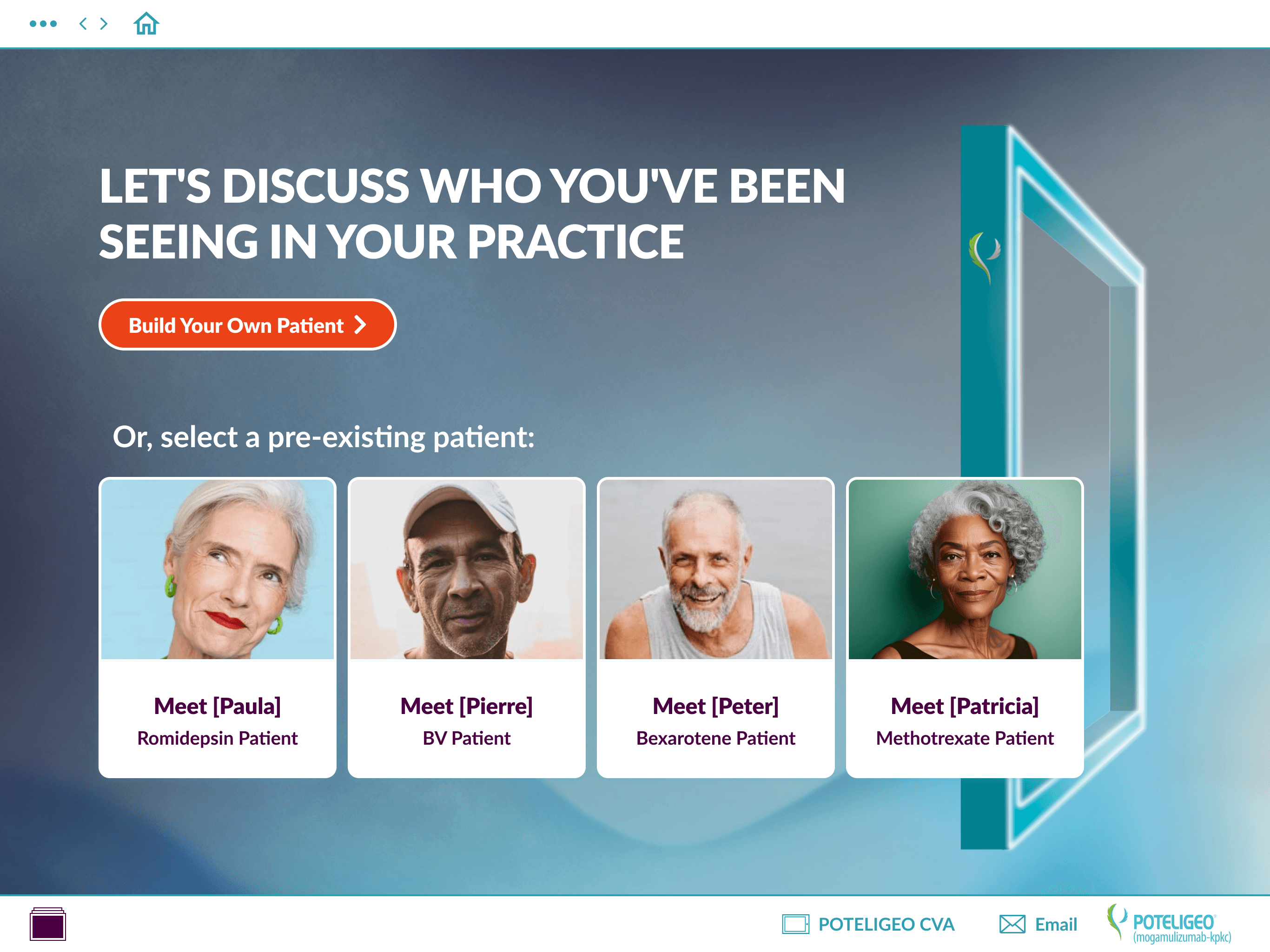
Homepage evolution
Early explorations tested how much campaign imagery vs. workflow visibility felt appropriate
Final direction balanced brand presence with a clear “start building” path


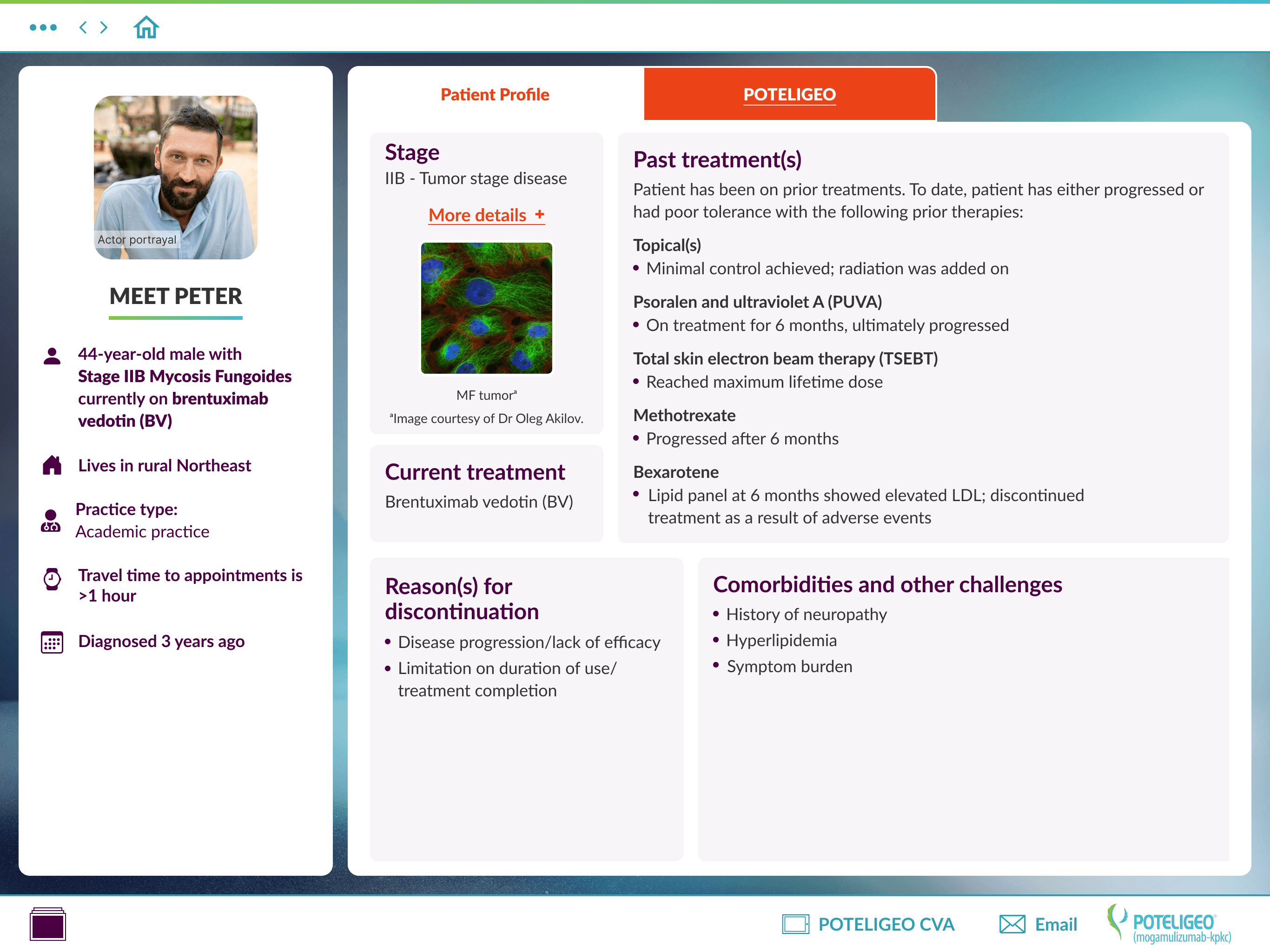
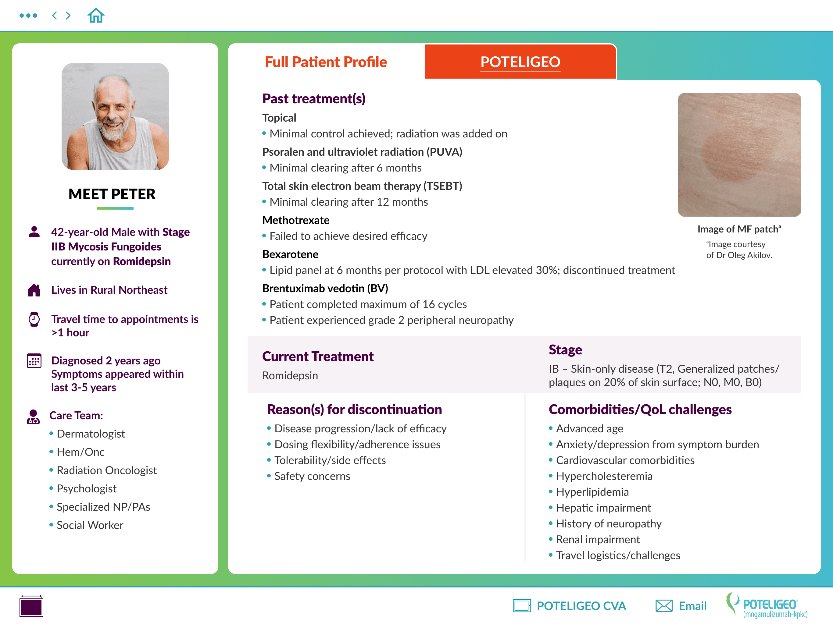
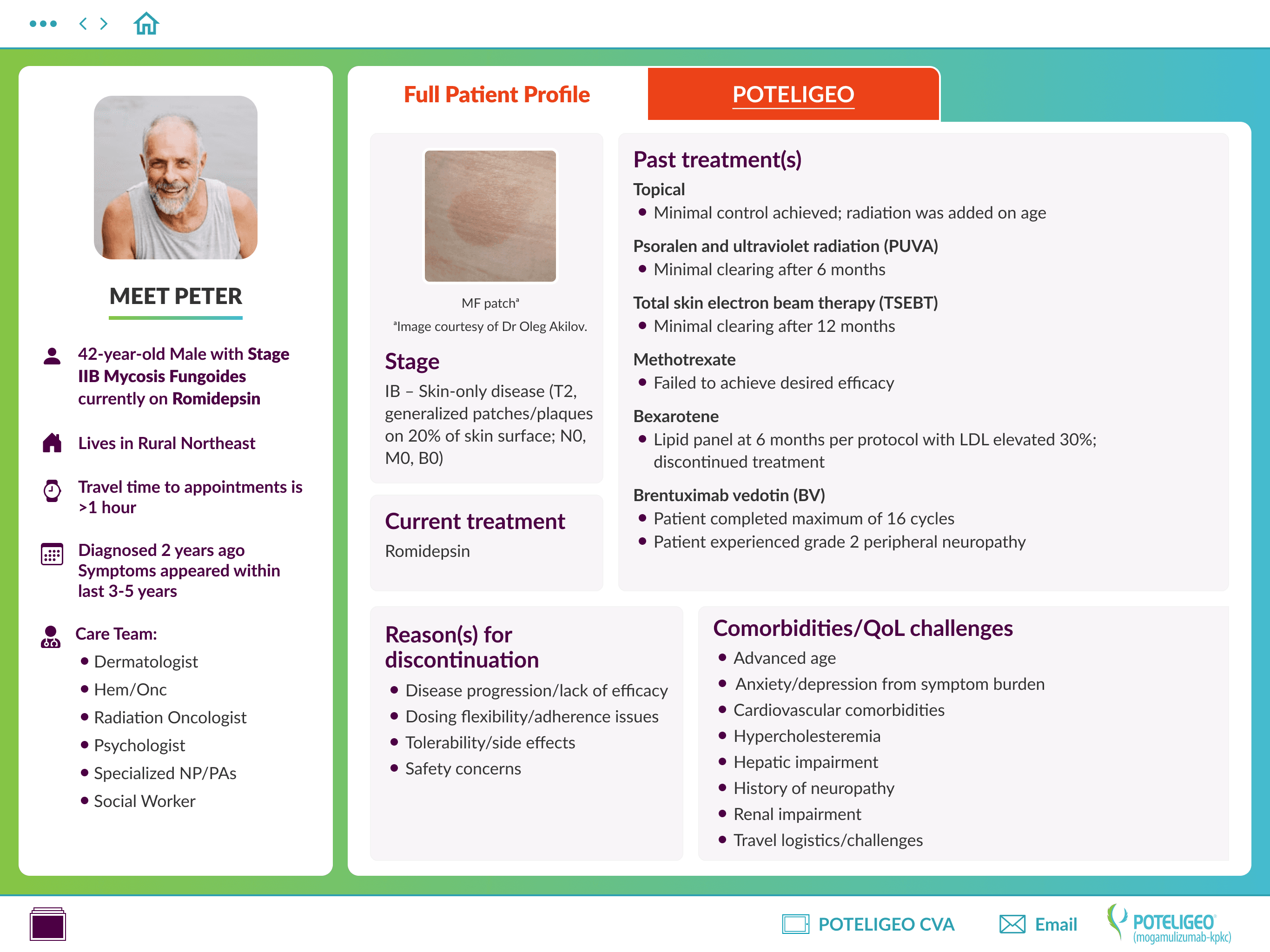
Profile output evolution
Designed for the largest possible data set
Used white containers over branded gradients to maintain clarity
Iterated layout hierarchy to support scanning during live discussions
Layouts were designed to prioritize scanning and discussion rather than exhaustive reading


Design System Thinking
To support speed and consistency, I created a lightweight UI kit including components, variables, typography, and color styles. This system allowed the team to move quickly while maintaining visual and interaction consistency, and provides a foundation for future expansion.
Sample Of UI Kit components

Outcome
The result is a brand-new tablet tool that supports both preparation and real-time collaboration with healthcare professionals. Through close collaboration, rapid iteration, and system-driven UI decisions, the product delivers a clear, intuitive experience for navigating complex patient data.
Final video Prototype
Next Up

Additional Work
Other bite sized pieces of my work

